We’re not generally big believers in graphic design trends. Design is more eclectic than ever and designers are drawing on more references, enabled by evolving tech and tools. Design principles endure, and great creativity finds a way to shine through.
Having said that, here’s some cool current stuff we can copy be influenced by.
Design for Accessibility
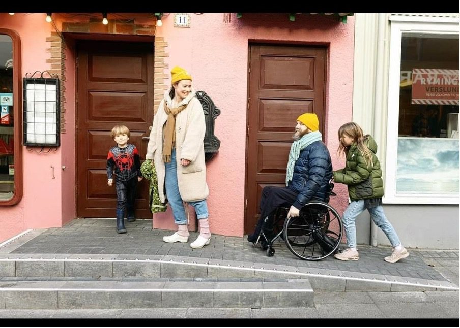
Many designers (including some at Sweartaker) resisted the need for accessibility when it first became a demand in web design in the late 90s. Our subtle colours! Our pixel-perfect tiny type! All had to go just because there was some middle-aged, colour-blind guy somewhere who wanted to read something, rather than appreciate how cool it looked.
But resistance was futile: Accessibility – rightly – became a standard requirement in web design and has since become a force in design more generally.
One inspiring designer has shown a commitment to accessibility that goes far beyond the screen. Halli (full unpronounceable name: Haraldur Thorleifsson) is an unreasonably talented designer from Iceland. Employed by Twitter to develop future concepts, he is arguably one of world’s most influential UX designers.
Halli is also a wheelchair user with first-hand experience of real-world accessibility issues. So he started another project, dedicated to transforming Iceland into the most accessible country in the world, one ramp at a time. So far, Ramp Up Reykjavik has installed over 300 ramps in restaurants, entertainment venues and shops all over the country, and they’re just getting started.
This is the design issue, so we’re claiming this as a great example of design thinking. Or is it just an inspiring combination of cleverness, caring and commitment?
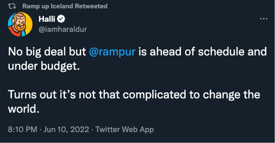
Design for change

Want to make a designer happy? Ask them to design a for a great cause – we love nothing more than a good preachy poster! But is our industry so squeaky-clean that we can go around preaching to others (for a small fee)?
How inclusive are we, really? To women? Minorities? The over-50s?
Thankfully, there are designers out there doing more than making posters that simply preach to the choir.
Despite the large numbers of women in design, in Ireland, only 11% of creative directors are women. WhyDesign – founded by Kim McKenzie-Doyle – is working to change that. They showcase leading female Irish talent, hosted a WhyDesign event, and, with Design Skillnet, even offered a 50% scholarship in Design Management.
Our friend and hero, Grace Enamaku founded DesignOpp – an organisation championing diversity for people of colour in the Irish design and creative industry.
And not Irish-based, but Creative Review’s ‘Creativity Sucks’ podcast recently released an episode that calls time on the “have a great career until you’re 50 and then you’re out” culture in the creative industry. Well worth a listen.
Designers – heal thyselves.
Big Trend
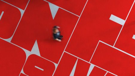
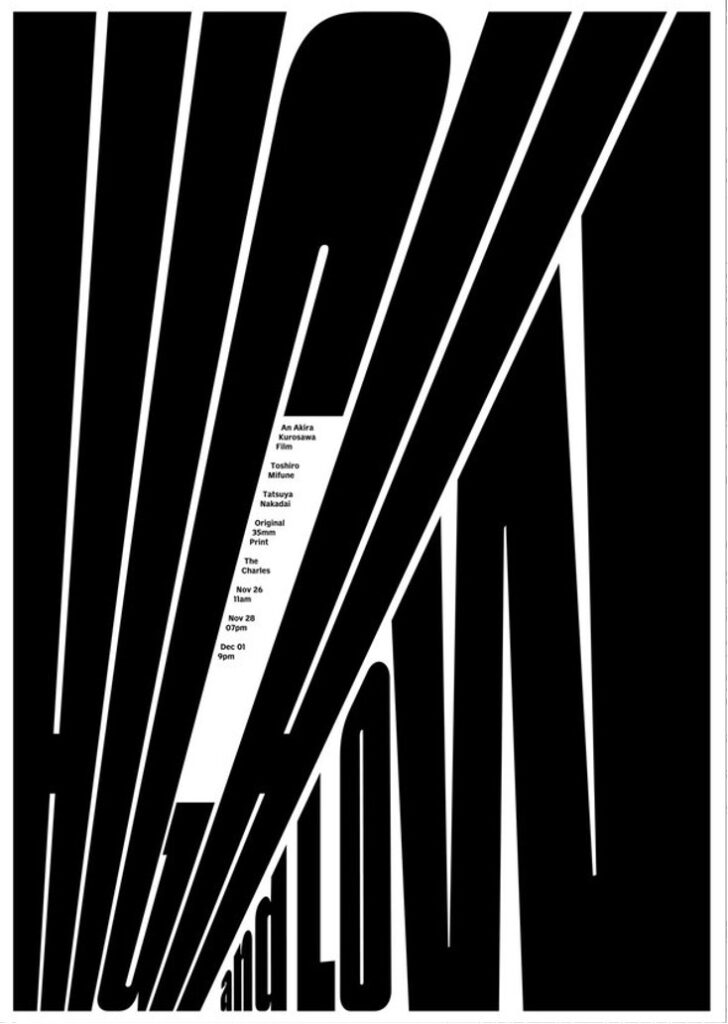
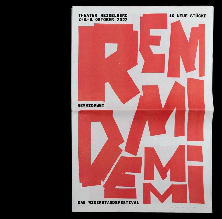
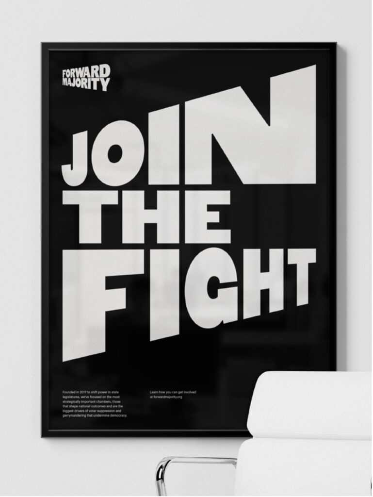
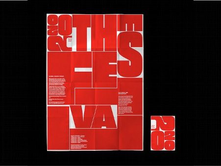
One area of design that is subject to ‘trends’ is typography. And one trend we like is the CUSTOM FIT BIG TYPE trend. Not just expandable letters (the latest tech bit), and not just BIG TYPE, but big type squashed and squeezed and expanded to fit the available space. This hits all our purist design buttons. It’s minimalist. It’s maximalist. It’s playful. It’s pure type. It’s a bit gorgeous.
And YES, we have tried it on for size.

Poster for Kurosawa’s High and Low, by Indian design duo November 
Poster based on the new brand identity for Remmidemmi, whatever that is, by @hla .studio 
Brooklyn studio Order designed the Identity for political action group Forward Majority around dynamically fitted type. 
Pentagram’s 2020 posters for the London Design Festival was an early influential example of this style.
The importance of being Yuni-que
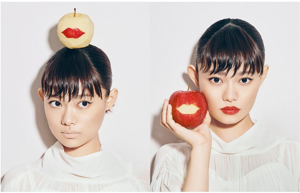
While it’s normal for an illustrator to have a signature style, and not uncommon for a graphic designer to have one, it is very rare to find an art director with such a strong visual signature that there’s a consistent visual style across dozens of different brands and campaigns.
Step forward Yuni Yoshida. The Japanese art director has created dozens of campaigns that manage to be visually unique, and yet all are in her signature style – high concept, gloriously colourful visual puns, arranged with precision, and styled to perfection. If Oscar Wilde was an art director, he would have been happy to show half as much wit and style.
Check out Yoshida-san’s incredible work here.
